Take the Stress out of Distressing
December 19, 2017
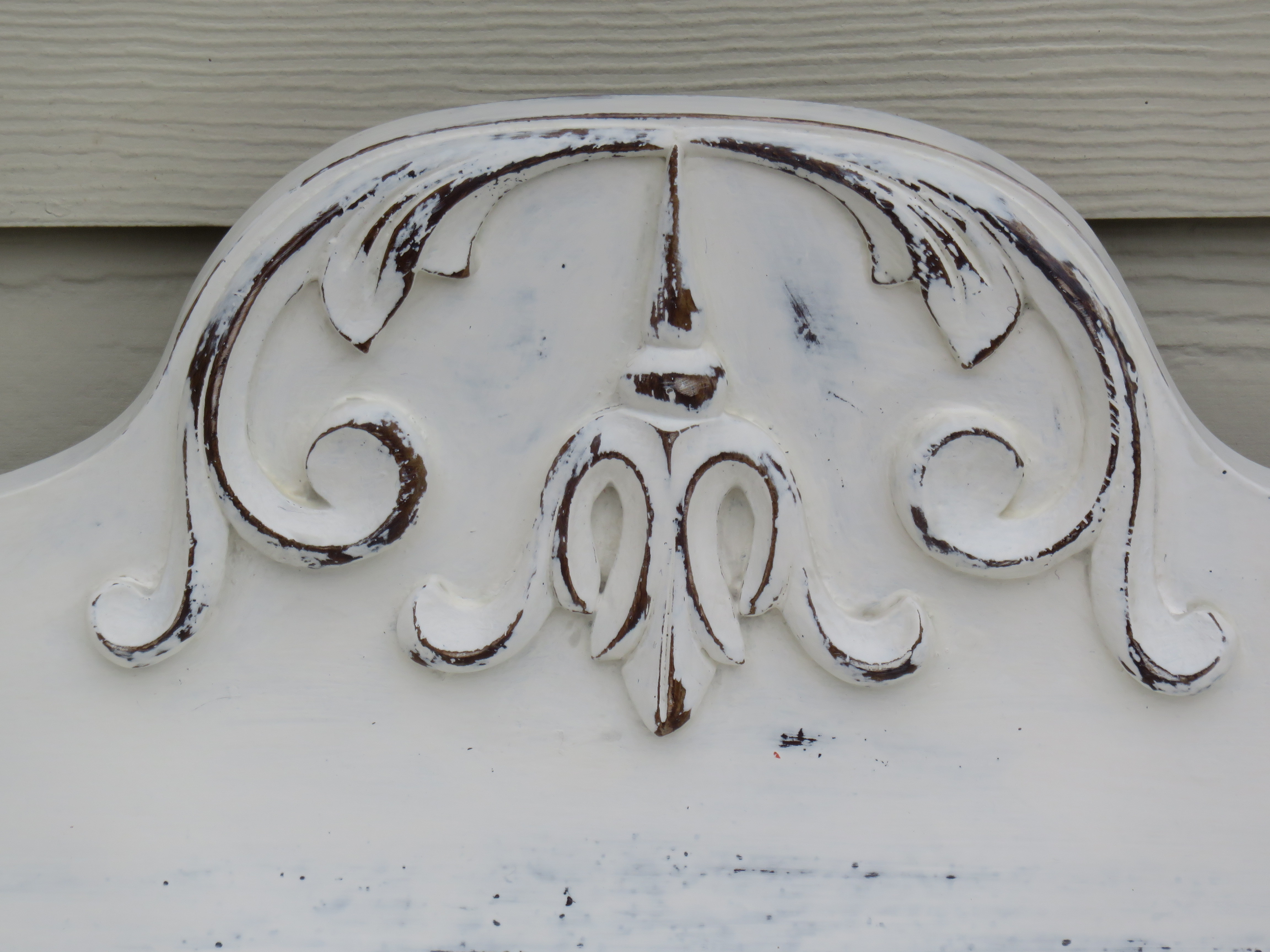
FAT Colour: “Warm White”. Finished with natural FAT Wax. Artisan: Debbie from Isn’t That Pretty
Shabby-chic. Aged. Worn. Perfectly imperfect. Distressed. Or… yes… not distressed at all.
Whatever you want, just go for it! Creating an effective and beautiful distressed finish on your freshly FAT Paint’d furniture look isn’t something to stress about. A lot of people are a bit apprehensive about the process, but you really shouldn’t sweat it. Frankly, I consider distressing the most creative part of refinishing furniture, but the effect is purely a personal choice.
Before you take a brush to any project, think about the look final you are trying to achieve. What is the piece saying to you? What is your personal aesthetic?
Before we dive into the wonderful world of distressing, let’s honour the modernists out there… NO you don’t need to distress your FAT Paint’d furniture! In fact, if mid-century modern is more your style, it’s very likely you don’t want any distressing at all… yet you really want that buttery smooth FAT Paint finish. If that’s the case, use a gentler touch when sanding your piece. Smooth out all surfaces with your sanding block or scrubbie, then work carefully around your edges and corners so that you don’t reveal any of the original finish. That’ll keep the surface smooth, the edges clean and your furniture piece modern.
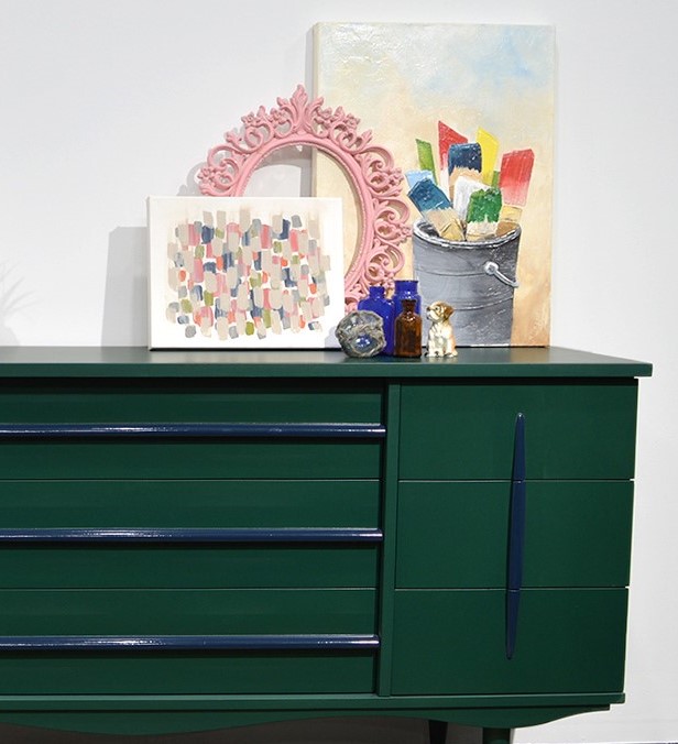
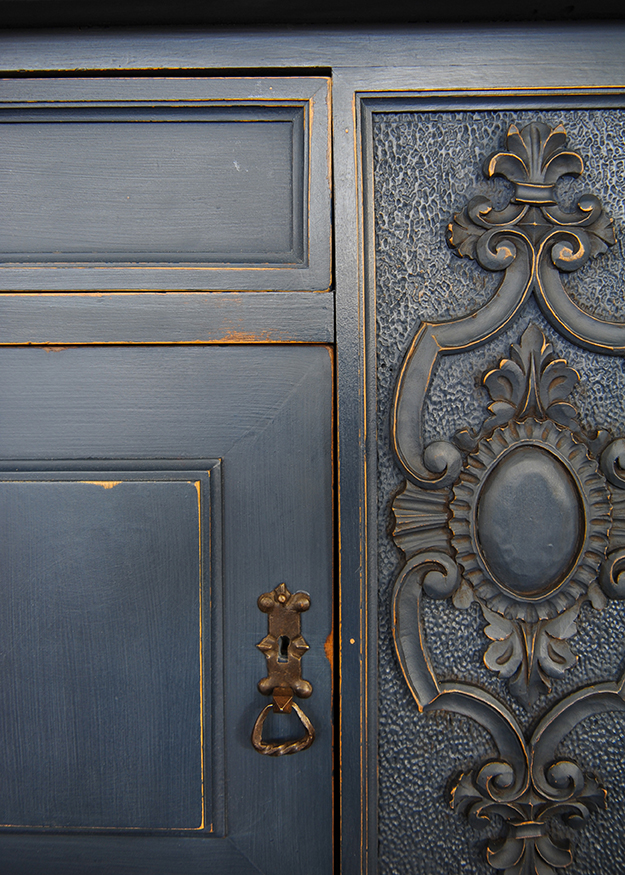
FAT Colour: “Cascadia” with “Navy State of Mind” on the pulls. Finished with a satin sheen clear coat on the boxy, gloss on the pulls. Artisan: Bradford from The FAT Paint Company
If you’re after a rustic farmhouse look, for example, enhance imperfections to give your distress some purpose.
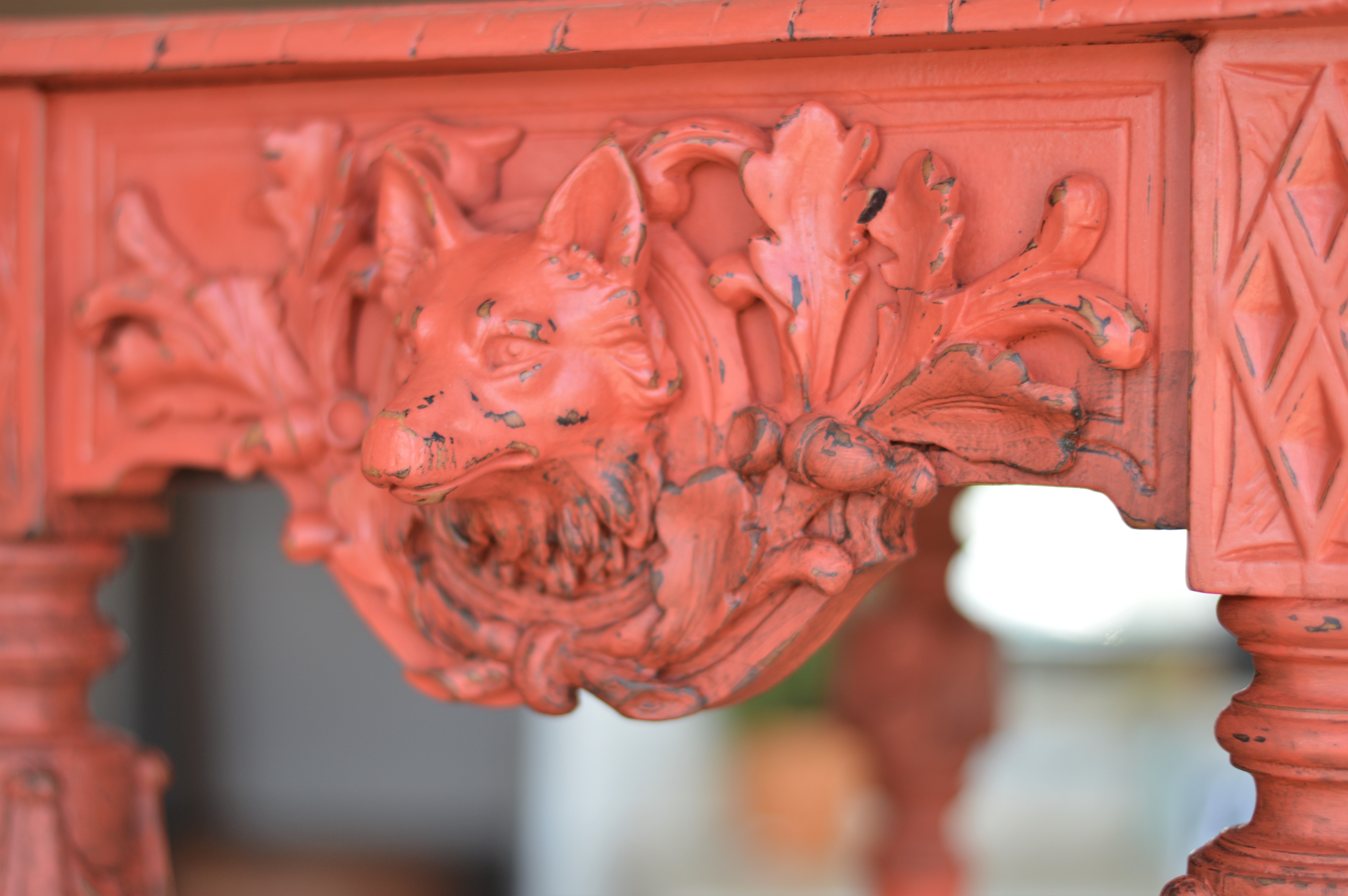
FAT Colour: “Autumn”. Artisan: Victoria from The FAT Paint Company
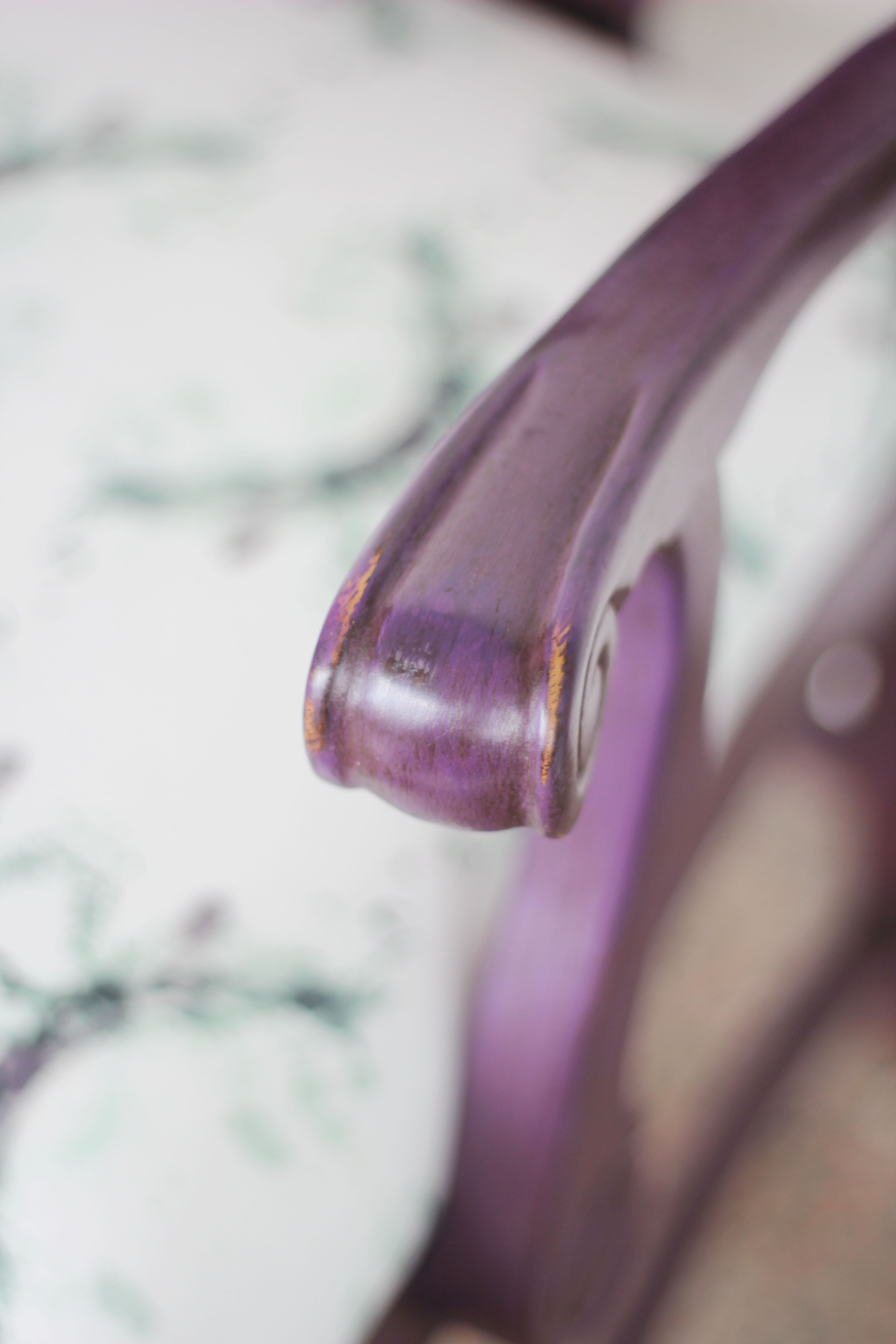
FAT Colour: “Cascadia” with natural and antique patina FAT Wax to finish. Artisan: Victoria from The FAT Paint Company
If you’re interested in a more subtle approach – just enough reveal to suggest that a piece has been loved for an age – your approach is more methodical and controlled.
FAT Colour: “Dharma” with natural and then antique patina FAT Wax to finish. Artisan: Victoria from The FAT Paint Company
And then there’s a primitive look, where distressing can be significant… perfect for enhancing those real imperfections that you just can’t (or don’t want to?!) hide. Pair this distressing with a heavy coat of Antique Patina FAT Wax and you’ve re-created history!
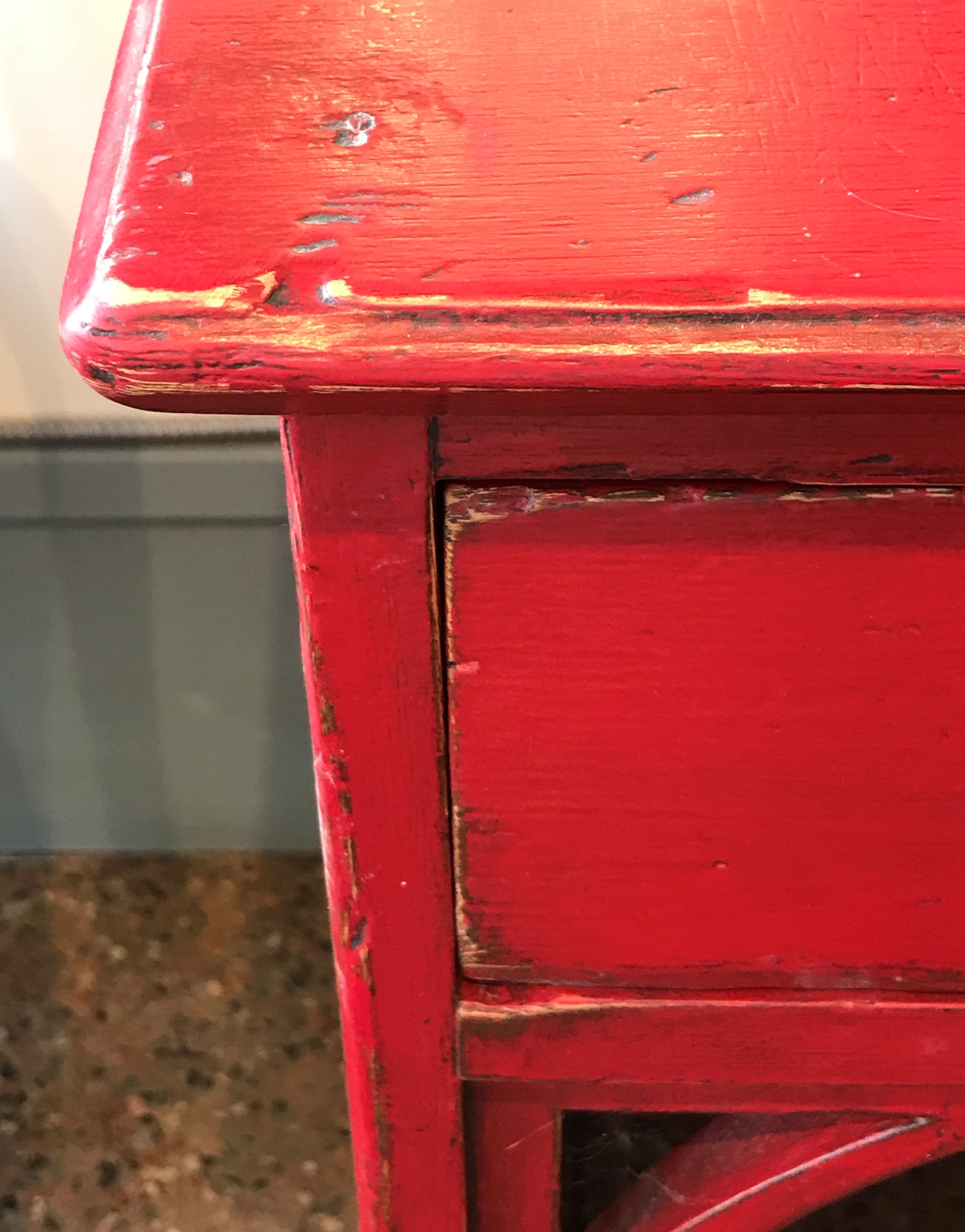
FAT Colour: “Red Barchetta” with natural and then antique patina FAT Wax to finish. Artisan: Bradford from The FAT Paint Company
If you do go with a shabby, aged, worn or perfectly imperfect look on your upcycled furniture, here are some general rules of thumb to keep in mind.
- Make sure the paint is completely dry before you start. Chances are you’ll create marks or flaws in the surface if you start too soon. When in doubt, just wait longer.
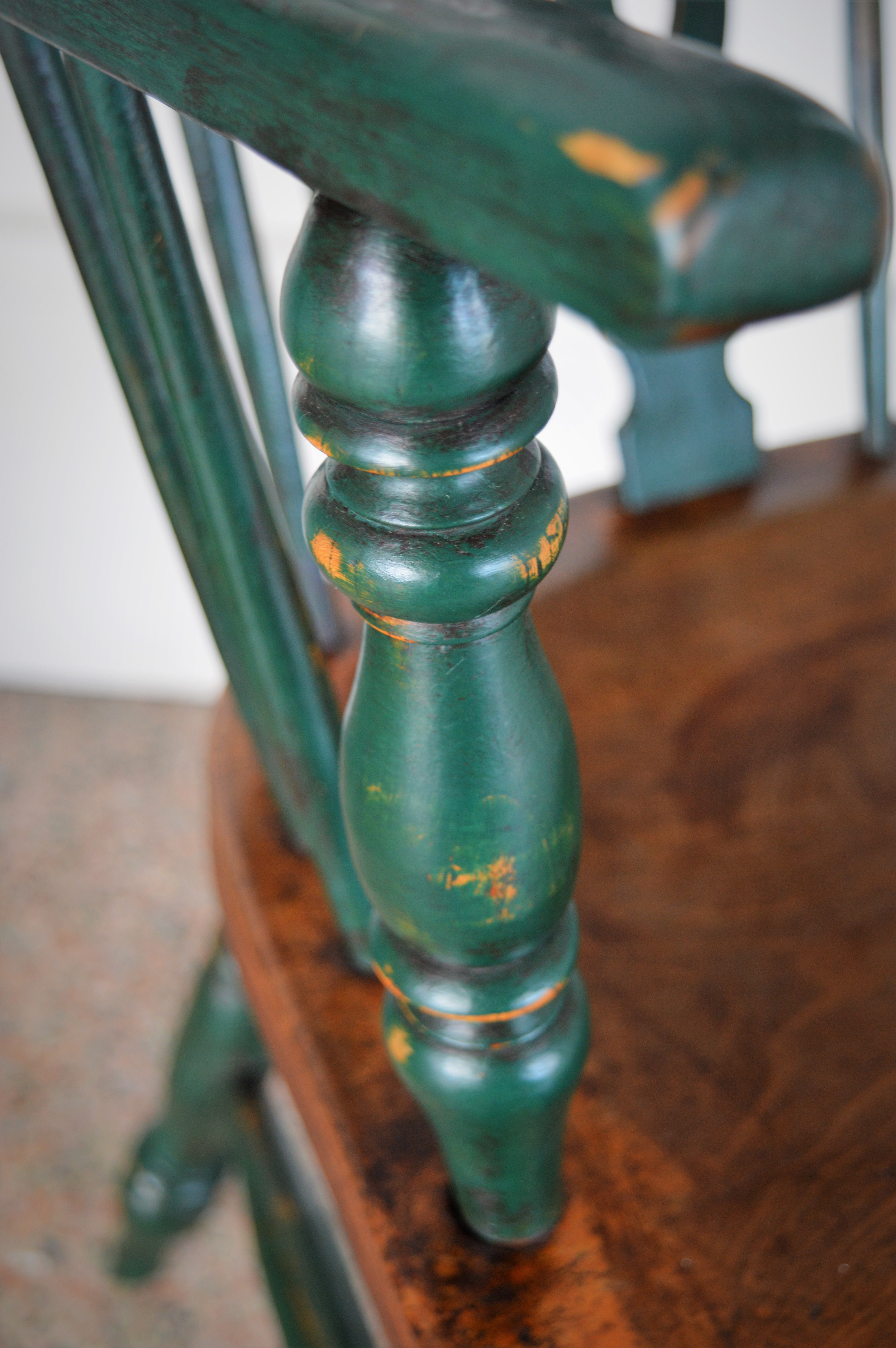
- Wear should occur in areas it where it make sense; don’t distress purely for the sake of distressing. Embrace and enhance any nicks, scrapes and cuts you may find in the surface. Focus on areas that would naturally wear and tear over time, like corners, edges, tops, raised decorative details, knobs and protrusions.
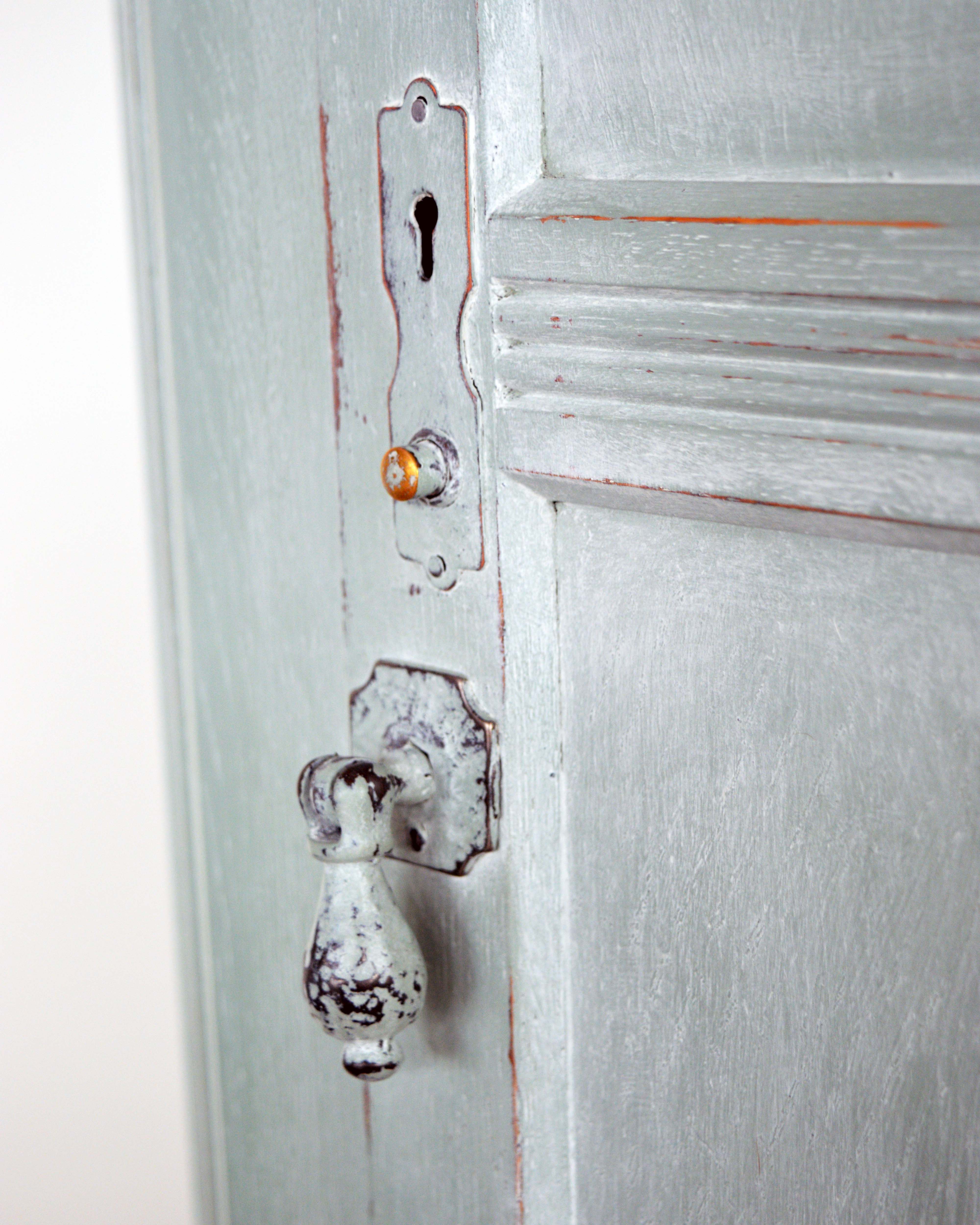
FAT Colour: “Ocean Spray” with natural and then white FAT Wax to finish. Artisan: Victoria from The FAT Paint Company
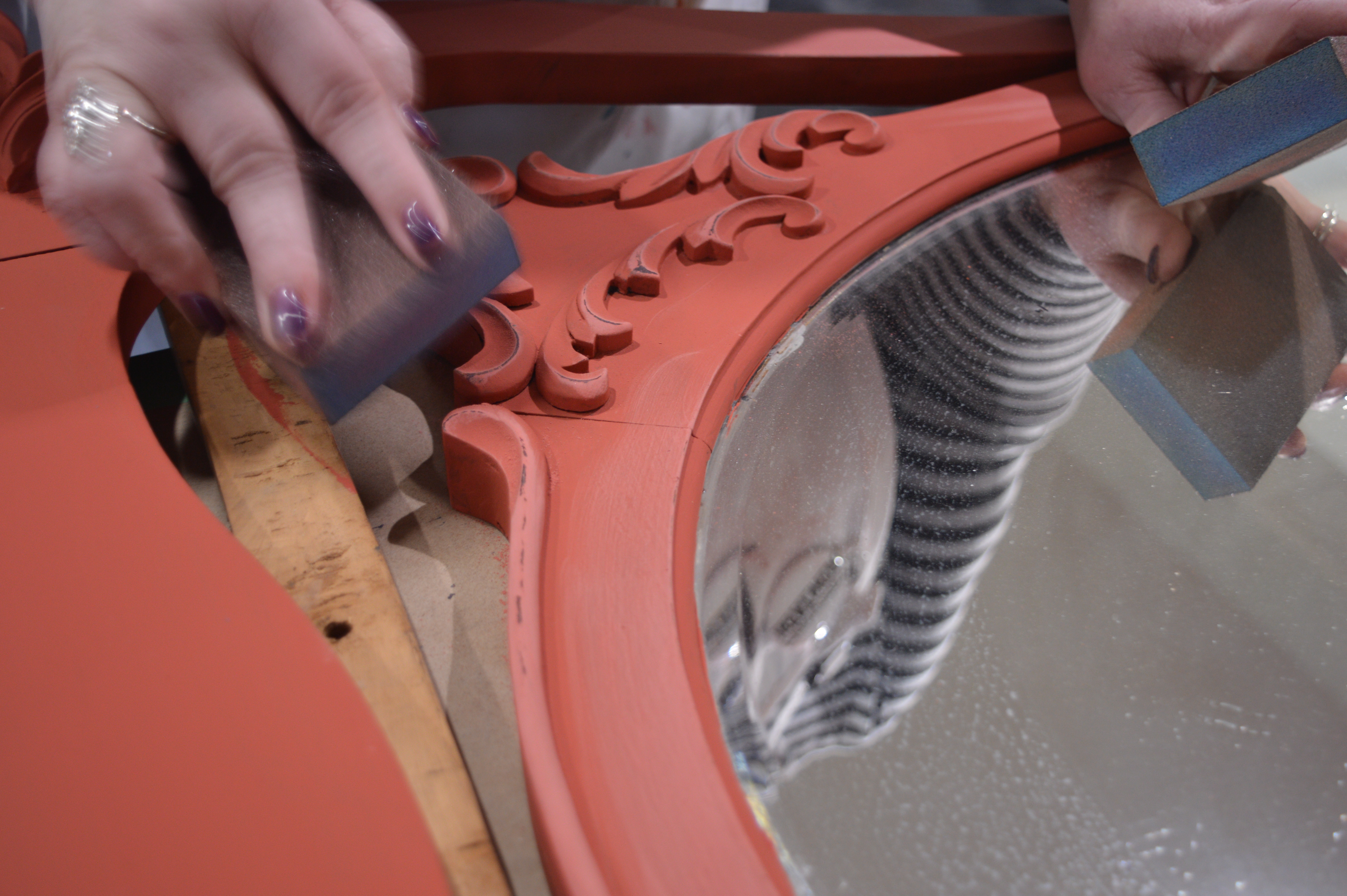
- Think about your tools. Sanding sponges with a medium grit on one side and a medium-fine on the other are (in my humble opinion) the easiest to use and give you the most control. They easily fit in your hand, allow for a comfortable grip and have a straight edge for hard-to-reach areas. That said, you can opt for plain sand paper, but make sure to think about the grit level. Using anything too abrasive may result in removing too much paint.
- Start with flat surfaces, then move onto the nooks and crannies. Trust us, it’s just easier that way.
FAT Colour: “Autumn” with natural and then antique patina FAT Wax to finish. Artisan: Bradford from The FAT Paint Company
- Remove sanding dust as it builds up. Excess dust on your surface—or sanding sponge for that matter—may result in an unwanted mark or divot. Keep a soft cloth nearby during the distressing process, lightly running it over the surface when needed. If you need to clean your sponge, the easiest way to do this is to keep a second one nearby, rubbing them together to get rid of the built-up residue.
- Less is more. When in doubt, start with a very light distressing before amping up the elbow grease. Remember: It’s easy to add more. Because FAT Paint covers like a dream, you can easily throw on an extra coat if you have gone too far, even if you’ve already FAT Wax’d the piece. That obviously takes more time and effort, so save yourself the hassle if you can.
There are so many posibilities with FAT Paint and a piece of furniture! Have fun, use your imagination, tap into your creative spirit. You’ll be inFATuated with the results!

FAT Colour: “Can’t See Me Camo” from the Amanda Forrest Collection. Finished with natural FAT Wax. Artisan: Bradford from The FAT Paint Company

FAT Colour: “Greysful” from the Amanda Forrest Collection. Finished with natural FAT Wax. Artisan: Victoria from The FAT Paint Company
FAT Colour: “Navy State of Mind” from the Amanda Forrest Collection. Finished with natural FAT Wax. Artisan: Bradford from The FAT Paint Company
Drop us a line
You must be logged in to post a comment.
Post Comments 0