How to Use: TFPC’s Specialty GLAZE
January 15, 2018
Another creative and fun way to enhance your FAT Paint’d projects is adding one, two or even four tones of our Specialty GLAZE.
With our Specialty GLAZE you can create unique, one-of-a-kind finishes. The water-based, translucent film transforms surfaces such as wood, metal and glass into prized heirlooms by producing an aged, antique-like look without the use of wax. Glazes can also be manipulated to build texture and patterns, including faux wood grain or marble.
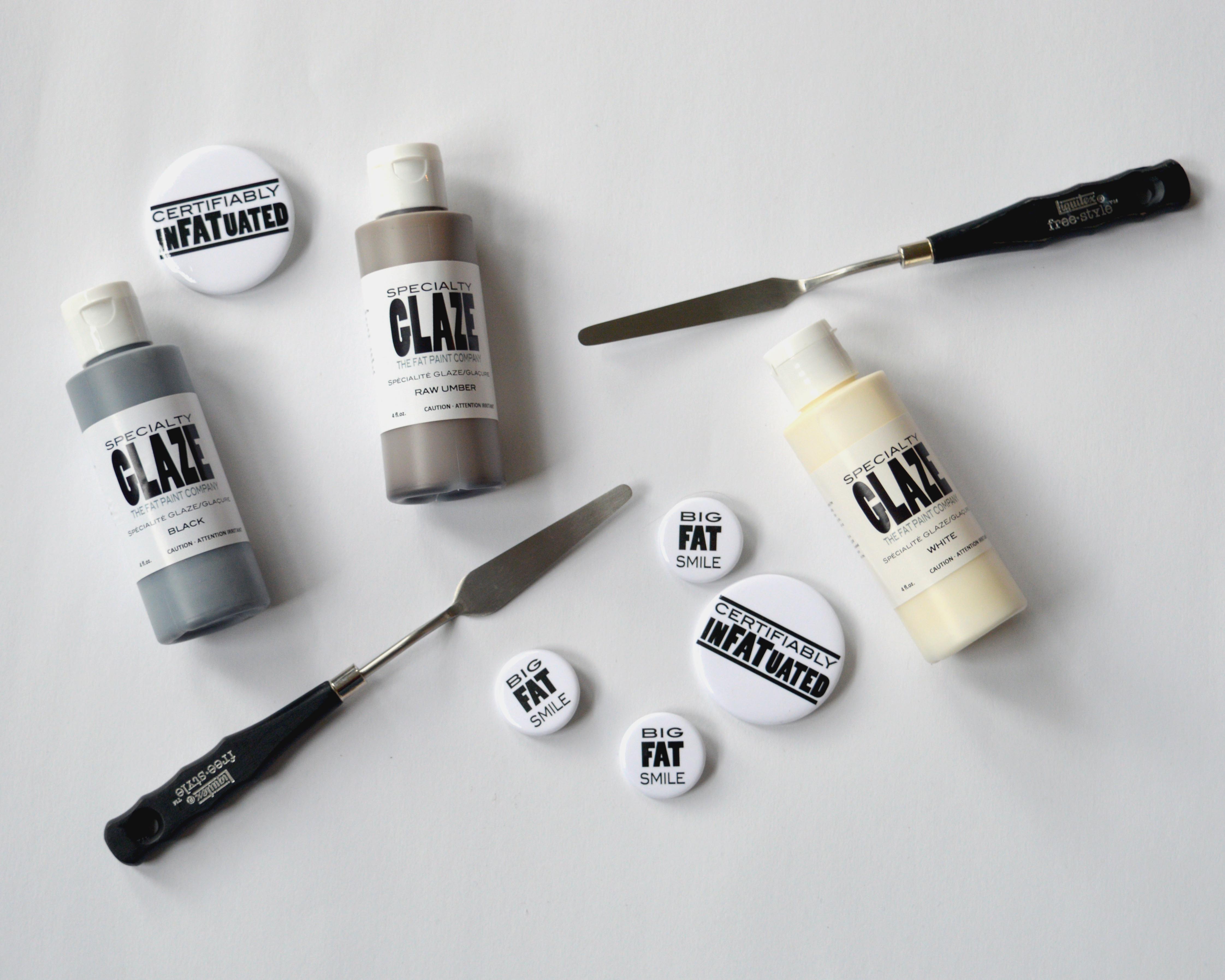
Each of our four beautiful, lightly-tinted shades—White, Black, Raw Umber and Raw Sienna—defines colours and shapes while bringing out the rich, dimensional details of any upcycled project.

So, how do you use a Specialty GLAZE? I’m so happy you asked!
First and foremost, DO NOT shake the bottle; gently rock it back and forth before each use to evenly mix the pigment.
One of the most important steps to achieve glazing success is to first seal your FAT Paint project with an application of CLEAR Top Coat. Once dry, FAT Paint is flat in sheen and porous, and that means that – until it’s sealed with either FAT Wax or CLEAR Top Coat – it happily soaks up anything that’s put on it. By applying a coat of poly on your FAT Paint’d piece, you create a smooth, much less porous surface (we call it a “slip”) that’s better suited to glazing.
Another tip is to work in sections. The “open time” of glazes – the time in which you have to work the glaze before it starts to tack-up – is where you’ll find the biggest application challenges. By working in manageable sections, you’re better able to accommodate the open time available to you. If possible, work with the item’s natural shape, corners and edges as your section (like one side of a frame or perhaps a drawer in a dresser). With larger expanses however (table tops, tops and sides of dressers), it becomes more difficult to create a section. Here you work big, and you work fast. The goals are twofold: don’t let the edges of your work dry as this will create “lines”, and don’t overlap your edges because this creates dark/tinted glaze patches. This is where practice is key!
Application techniques will depend on the look you’re wanting to achieve, and that goes for the tools you’ll choose to use too. Here are just a few of the techniques you could try:
— Apply using damp sponge (any kind, however sea sponges are very good) or damp cloth (scrunched up in your hand so that there are creases and folds, looking a bit like a rose), dip into the glaze and then tamp on the surface. Work quickly as this method has a short open time.
— Apply glaze with a brush or a roller directly into the sections you want the glaze to settle. (Note that we recommend a 4″ low-nap velour or velveteen roller. No sponge rollers or “brushes”)
- When working with detailed frames (see example below), jam the glaze into the cracks and crevasses and then wipe away excess glaze along the high sections with a damp sponge or cloth. OR
- Apply directly in corners and framing found on cupboard doors or the sides of dressers (like just under the top or along the sides) and then, using a damp sponge or cloth, push, move and remove the glaze, blending into the non-glazed sections as you work the section.
— Cover your section corner-to-corner using a good brush or roller.
- Tamp back with a damp sponge or damp scrunched-up-in-your-hand cloth. You may want to move or push the glaze as you work, or you may not. OR
- Using a coarse bristle brush, create a striae finish. To do this, start at one end of your section and drag back in one long, even and straight (or purposefully squiggly) stroke. Dry off any glaze accumulated on the brush before attempting the next stroke. OR
- Using a specially designed tool, create patterns in the glaze (like a wood grain for example). These tools can be hand-held rockers or rollers and can be found in specialty paint stores, craft stores and on-line shops. OR
- Roll your rag across the surface.
There are so many options and techniques to try!
Some additional tips:
- Dispense your glaze into a something shallow so that you can easily dip in with your sponge or cloth. If using a roller (see recommended type above), dispense into a anything low with sides. Only dispense as much as you need. You can always squeeze out more.
- You can thin your glaze with a touch of water or floetrol.
- Consider doing a test board in the FAT Paint colour you’re working with so that you’re confident that the glaze colour you’ve chosen compliments it.
- Use a light hand and build your glaze up. A natural look is ideal so start with a light application and let it dry. If the affect is too light, you can always add more… but you can’t remove what’s applied if you’re too heavy the first time ’round.
- Be consistent with your application technique. All drawers and doors, for example, should look the same.
- This last bullet is really the first thing you should do, and that’s practice. Practice, play and learn 🙂
Lastly, we recommend that you finish your project with another application or two of CLEAR Top Coat. This protects your work, evens out sheen tones and helps to provide a more durable surface for the piece overall.
Here are a couple of examples to take away.
Artisan: Lynda from The Abode: Cloverdale while here at TFPC for a Retailer Training Workshop
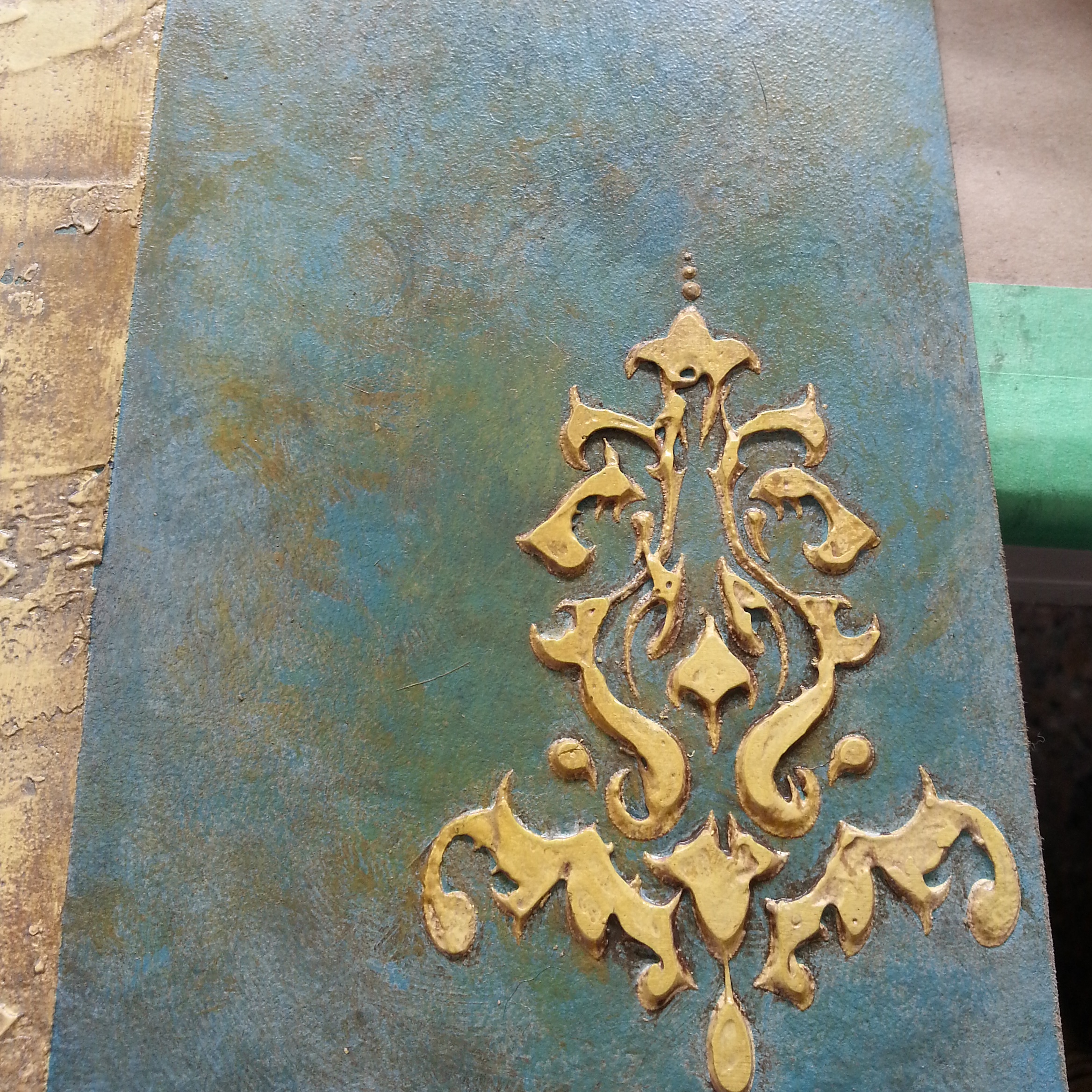
On the sample board above, we started by painting the background in “Peacock”. Once dry, an embossed shape was created using Extra FAT mixed with our retired colour “Buttercup” and then spread over a stencil. Once the embossed shape was dry, it was lightly sanded, then the entire surface was sealed with our CLEAR Top Coat and allowed to dry. Next came the application of 3 Specialty GLAZE applications, starting with brown (“Raw Umber”) and then yellow (“Raw Sienna”). The white glaze was applied last. Application was done with a sponge, tamped around the surface. Quickly, before the glaze set, a damp cloth tamped the areas where glaze had been applied to both lift and move the glaze. This action was repeated with each glaze/colour application until the desired look was achieved.
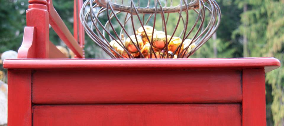
Beautiful “Red Barchetta”! This is an example of applying and pushing the glaze directly into the corners and edges of a piece. FATtabulous!
Artisan: Isn’t That Pretty
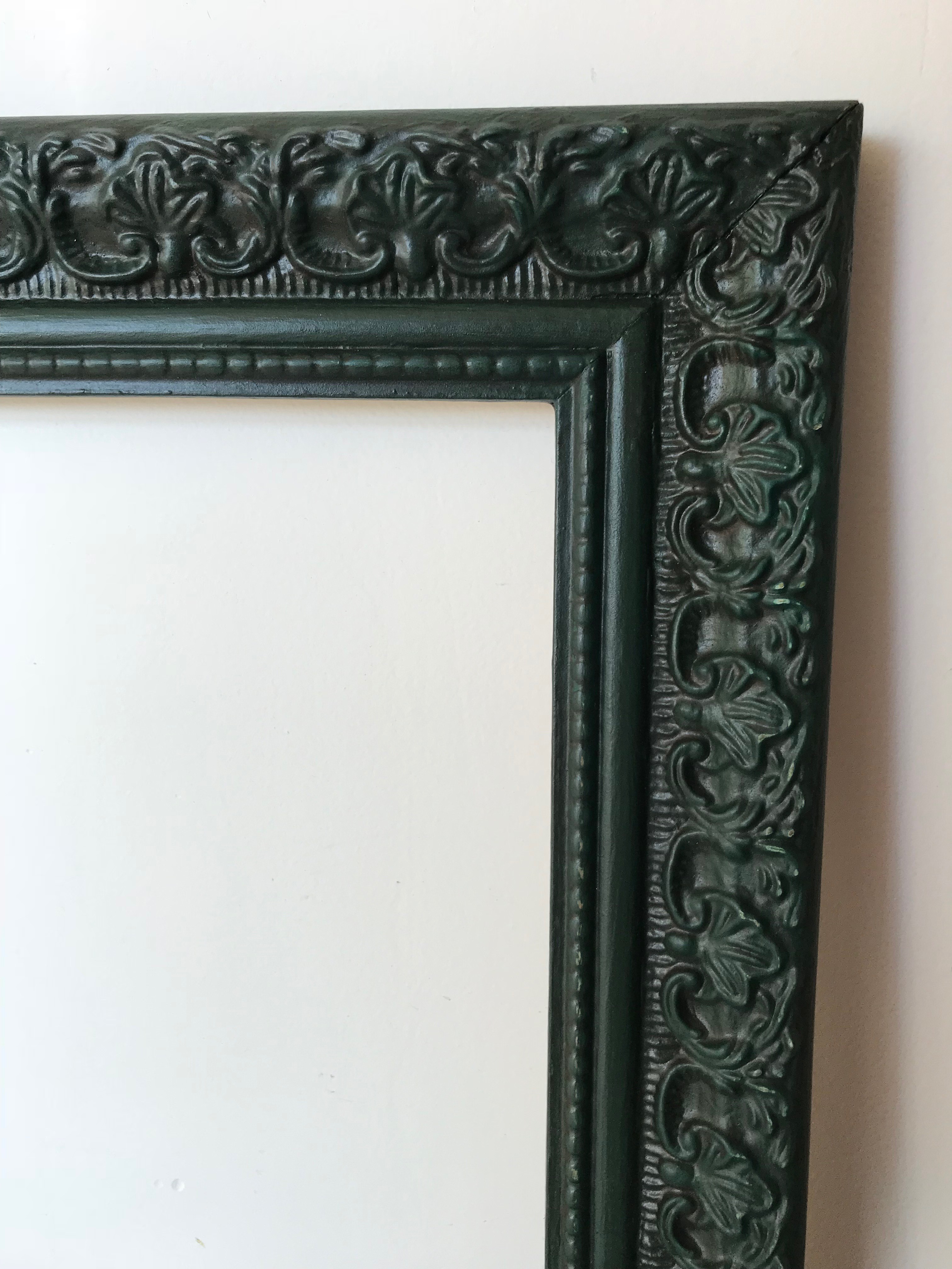
Below is a close up of a frame FAT Paint’d in “Cascadia”. After an application of CLEAR Top Coat, our “Black” Specialty GLAZE was applied using a brush to push it into the details. Before the glaze dried, a damp cloth was wiped across the surface to remove glaze from the high areas. The result is an overall subtle variation in colour tones, with a deep greeny-black in the details.
Artisan: Victoria from The FAT Paint Company
Have some FAT fun with your glazing project!

Drop us a line
You must be logged in to post a comment.
Post Comments 0