How to Use: Extra FAT
October 10, 2017

Now that you’ve mastered your FAT Paint technique, it’s time to get a little more creative. That’s where our speciality products, like Extra FAT, come in.
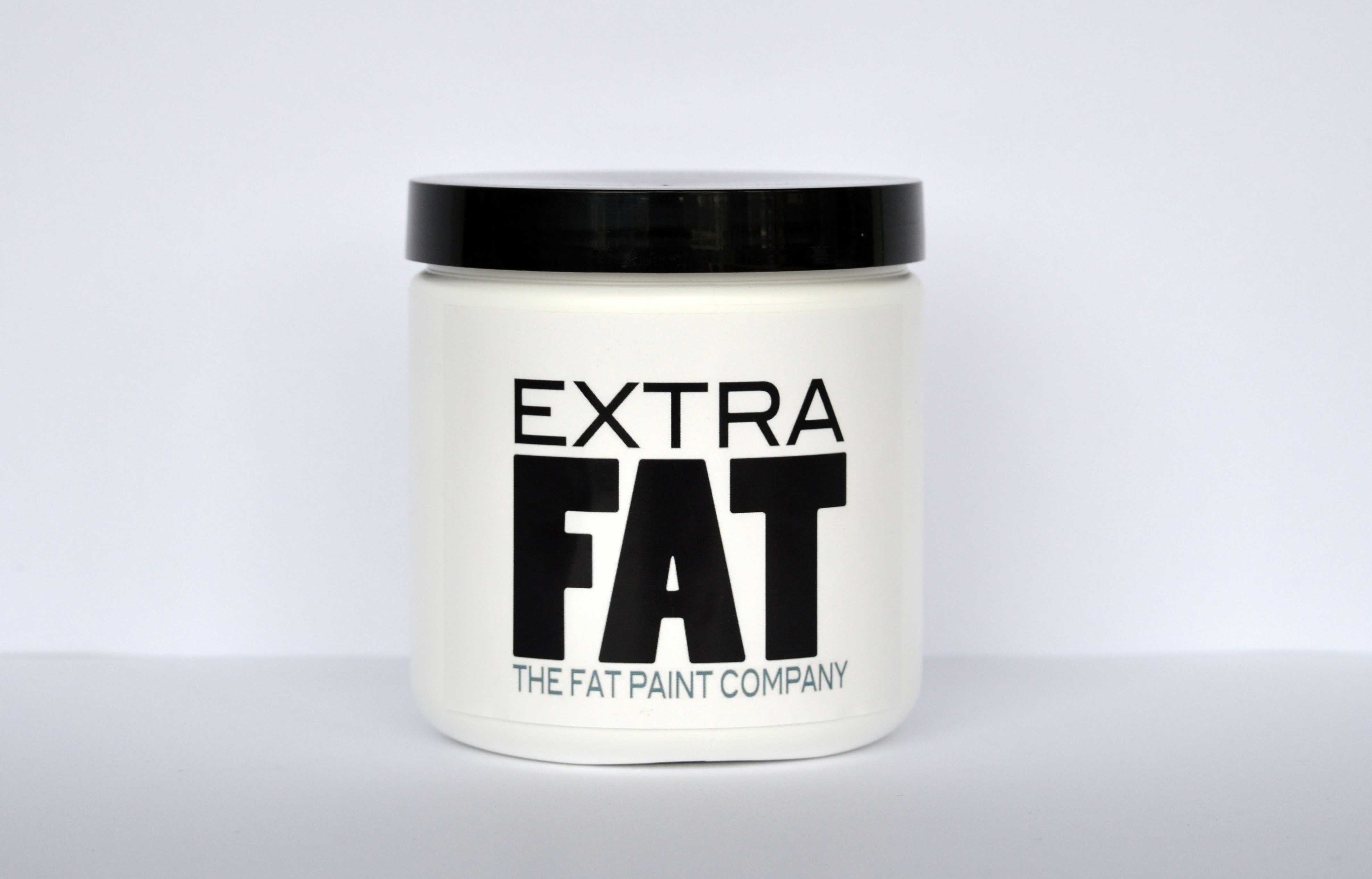
Extra FAT enhances the consistency of the paint—perfect for the artisan who wants to FAT’n up their projects with added dimension and texture. The 100% all-natural powdered additive is ideal for creating embossed reliefs and crusty, aged or chippy textures weathered from years by the sea. And the great thing is that you’re creating your texture or embossed image in the FAT Paint colour you want.
It’s simple, easy and oh-so-much fun! You can use a little or a lot—it’s really up to you!
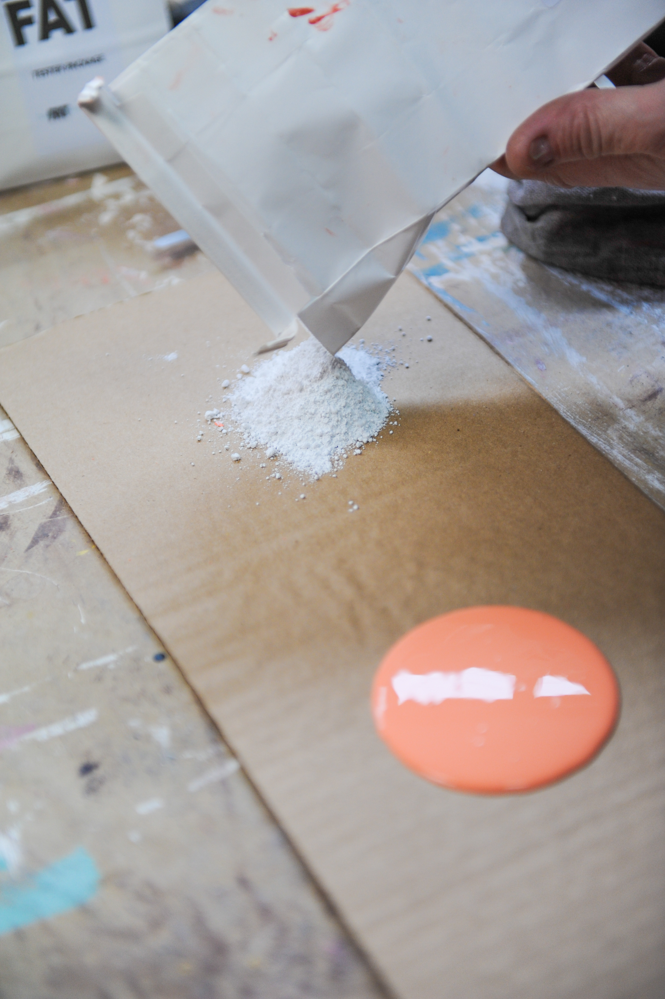
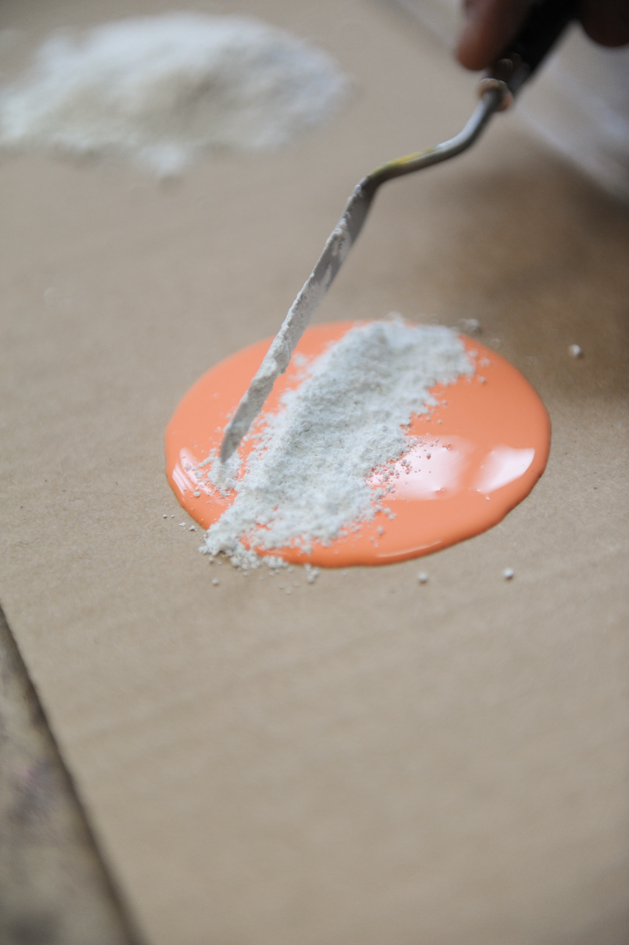
Regardless of the kind of look you’re after, we recommend starting off with a small amount of our chalk-style paint—a little bigger than a silver dollar pancake—and add powder as you go until your desired consistency is achieved. The paste should feel similar to a stiff icing. If you add too much Extra FAT to our FAT Paint, just add one drop of paint at a time to thin out the mixture.
Some people prefer to use a flat plate or a palette board to mix their Extra FAT. Mixing it in a cup or bowl works too, but it can be challenging to get your application tool into a vessel.
It might be a good idea to play around with Extra FAT, to get familiar with it, before creating a special project with it. Because a little paste can really go a long way, we find it easy to make too much that just ends up in the trash once the project is complete. While you’re playing around, consider making up some sample boards for your store to show off different effects and techniques to your customers.

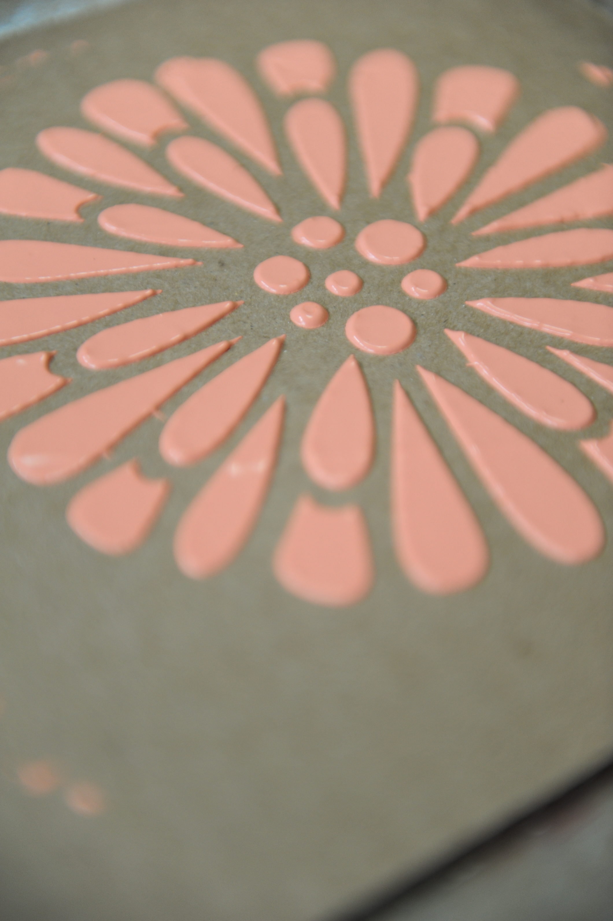
Embossed relief effects:
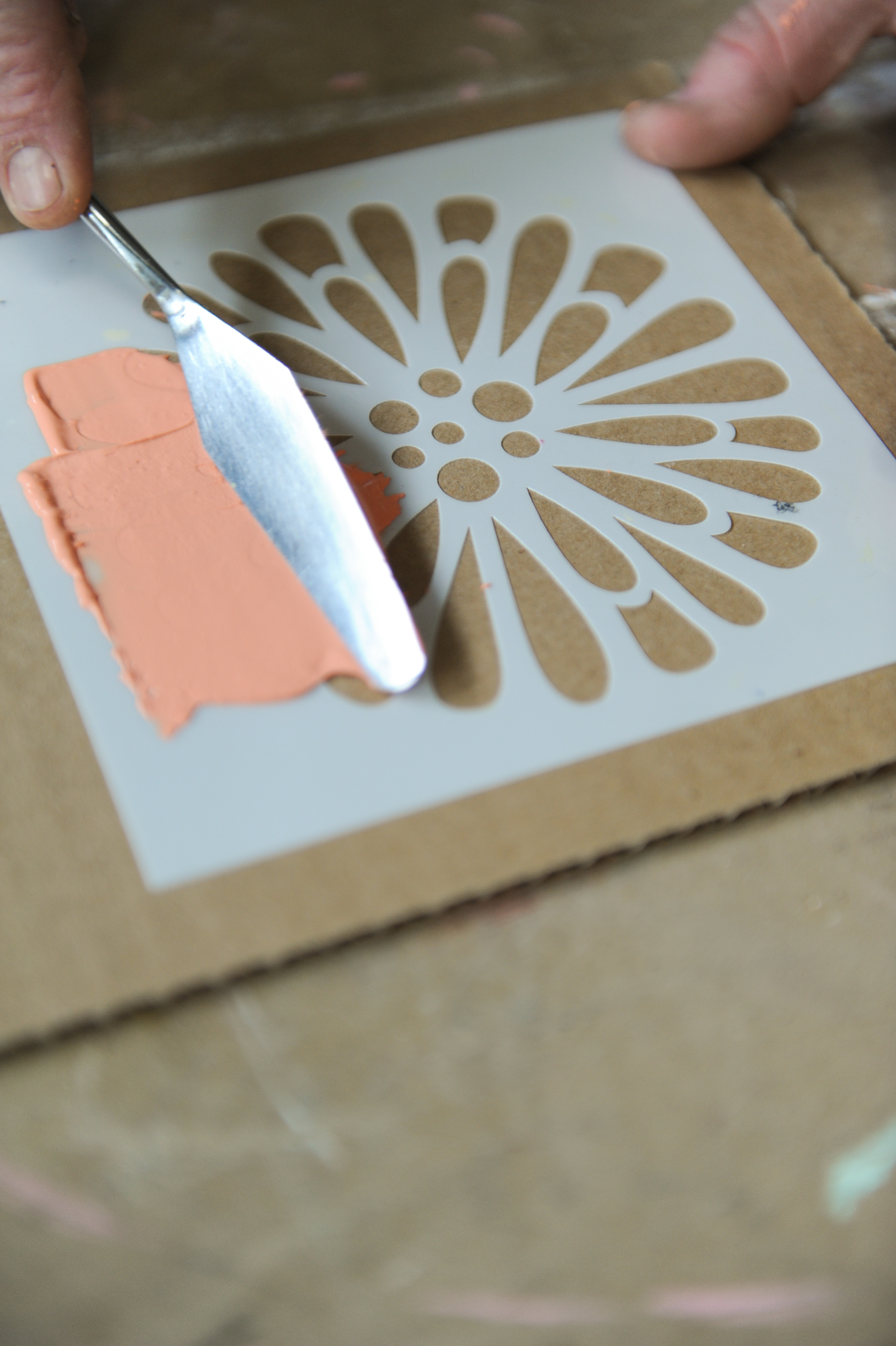
Embossed reliefs require a firm paste. Make only as much Extra FAT paste as you think you’ll need for your project. The paste will stiffen as it dries, which makes it harder to spread, so you’ll want to use it relatively quickly.
If you’re using a stencil, make sure to secure it to your FAT Paint’d surface with either painter’s tape or low-tack adhesive spray. Now, take a palette knife or putty tool and spread an even layer of the paste you just made across the stencil. Carefully remove the stencil before the paste dries. Once the paste is completely dry (several hours may be needed), lightly remove any high points on the relief with sandpaper.
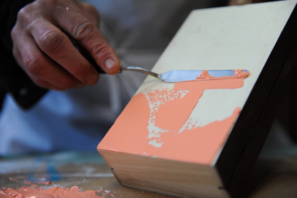
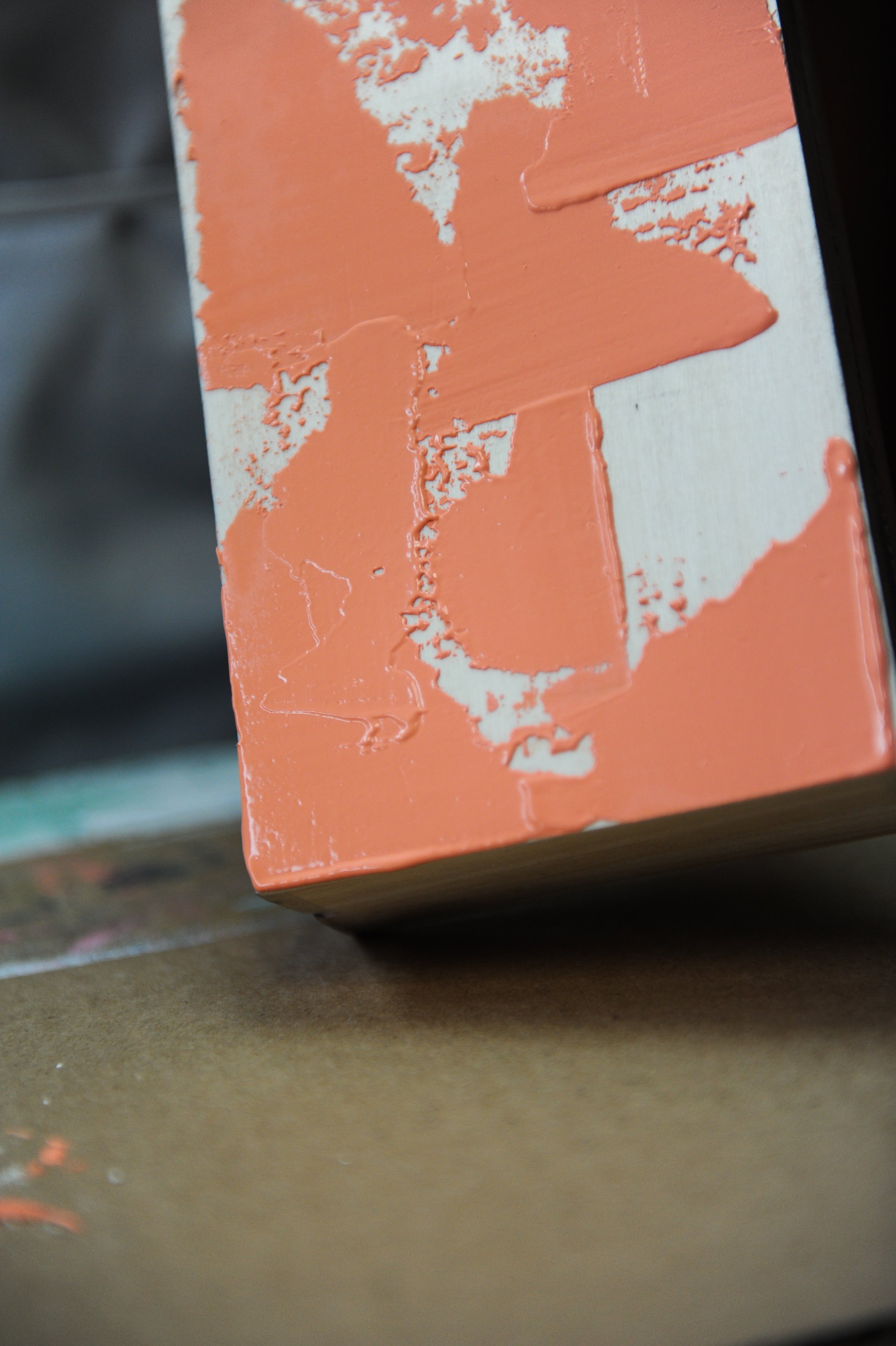
Base textures:
Creating base textures with Extra FAT may require more paste than embossed reliefs, but again, only make as much as you think you’ll need. The consistency of the paste really will depend on the type of texture you want to create, so play around with it before taking on a special project to make sure you achieve the effect you’re looking for.
Different application methods work for different looks: you can stipple, brush or spread the paste on the surface, for example. Some people like to layer colours to enhance the texture. Others like to create an antiquing or patina effect or colour high/low-lights by using tinted FAT Waxes or FAT Speciality Glazes. The world really is your oyster when it comes to Extra FAT. We encourage you to play around; get creative. And most importantly, have fun!
Again, let the paste dry completely before you lightly flatten the surface by sanding peaks and valleys, or until desired effect is achieved. Sand a little, sand a lot—it’s really up to you! Then seal the surface with either FAT Wax or CLEAR Top Coat.

Here are a couple FAT-tastic projects showcasing how Extra FAT embossed or textures can be used:
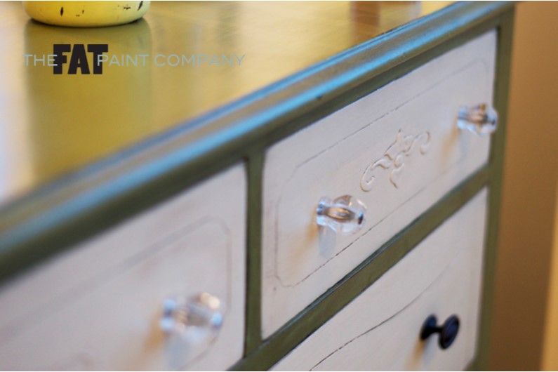
Victoria used Extra FAT mixed with “Cream” to create embossed images on the top drawers of this dresser. She enhanced her work—along with the decorative details already in the drawer—with antique Patina FAT Wax.
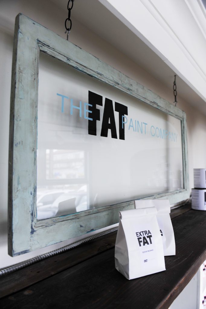
What looks like an old chippy window painted numerous times over the years is actually an IKEA Billy Bookcase glass door.
To create this look Bradford first FAT Paint’d the frame with “Cast Iron”, then applied a layer of “Caribbean Blue” and another of “Ocean Spray”, sanding back to reveal the “Cast Iron”. Hr then applied some Extra FAT (similar to the “Coral Reef” example above) mixed with one of our retired colours called “Sea Glass Green”. The end result = awesome!
Bradford enhanced his textured layer with a light sand followed by an application of Natural FAT Wax to seal in the paint. He then applied our Patina FAT Wax to bring out the details and create an overall aged look. This sign hangs in our retail mercantile shop in New Westminster, BC.
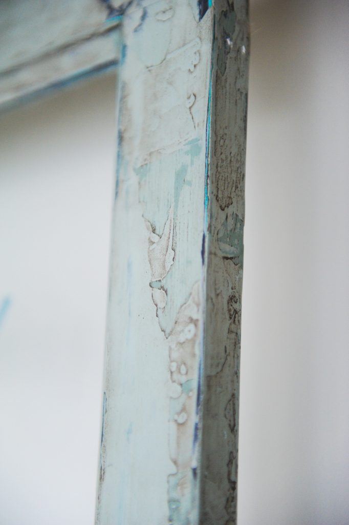
A close-up of Bradford’s “old chippy window” sign really shows the textured goodness!
Drop us a line
You must be logged in to post a comment.
Post Comments 0